Scribblenauts Keycaps
Jan 10, 2025Scribblenauts will likely to go down as the most acclaimed game of my career. It won Overall Best of Show at E3 2009 from both IGN and GameSpot, beating out the likes of Mass Effect 2, Uncharted 2, God of War 3, Modern Warfare 2, and many others. This, on top of many other accolades, both before and after release.
The gameplay may not live up to its glowing reception, but the hook of “you can create anything” certainly grabbed peoples’ attention. It was driven further into the public consciousness by NeoGaf Post 217 (contains “colorful” language). Not all of what was described in the post was even possible in the E3 demo, but the experience left an impression on forum member “Feep” all the same. We tried to fulfill the promise of the post for those who would eventually try it themselves, even including “post two seventeen” as one of the games spawnable objects.
With all the love Scribblenauts was getting, you may think great attention would have been given to every detail. But 5TH Cell was not a large company, and the team was split, developing both Scribblenauts and a follow up to Drawn to Life at the same time.
The concept originally had you scribbling in a notepad to spawn objects. While that made it into the game, state-of-the-art handwriting recognition on a Nintendo DS was not great. An on-screen keyboard was thrown together quickly as an alternative. It ended up being a better experience, and unanimously became the default for creating new items. For the longest time, the characters on the keyboard were plain, Arial or something similar. I didn’t retain any significant backups after leaving the company, and I haven’t been able to turn up any pre-release screenshots to corroborate. The plain keycaps felt misaligned with the “scribble” in Scribblenauts, now that the keyboard was the default.
Around this time, my eyes had been opened to the wider world of design by the documentary, Helvetica. I was freshly aware of the impact of the typefaces all around us, and so I talked up wanting an updated keyboard. There was some agreement from people I mentioned it to, but it was clear nobody wanted to allocate development time to make it happen. Over a few days of light, after hours work, I drew up a new set of letters for the keyboard. As a programmer, there weren’t any professional tools at hand for this. The letters themselves were drawn in Paint.NET. On the weekend, I came in and updated the keyboard in the codebase while nobody was around to tell me otherwise. We didn’t have a rigid code review process at this stage in the game. It wasn’t perfect, but when everybody got around to seeing the changes, it was generally recognized as a step forward.
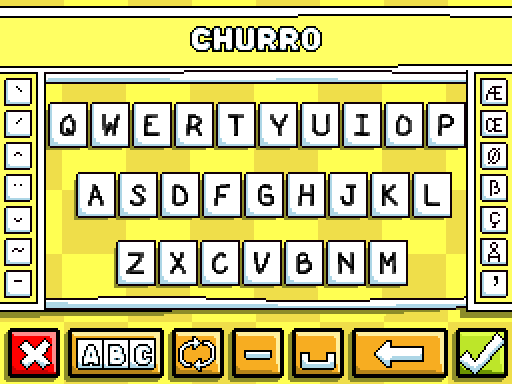
It felt like our game was going to be a big deal, and I wouldn’t have been happy leaving the keyboard unchanged. The end result is still not completely satisfying, the O and D are too similar for one thing. But it was apparent that nobody else cared enough to make a change, especially considering we kept the characters as-is in the sequel.
Of all the things I worked on over the course of development, this one bit of effort, completely outside my normal responsibilities, stands out most in my memory. Your ideas might not always be met with unanimous excitement, but if they matter to you, you might not want to leave it to someone else. You deserve to be satisfied with your work.